
We were delighted to be working with Chimera Communications on the design and branding for The Wood Store, otherwise known as the Brighton & Hove Wood Recycling Project. One of the first of its kind in the country, they are dedicated to recycling waste timber – seeing it for what it really is: not something to discard but a precious resource.
Having been perceived as being too commercial, the branding needed to reflect their charitable objectives: environmental protection – education – relieving poverty.
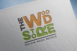
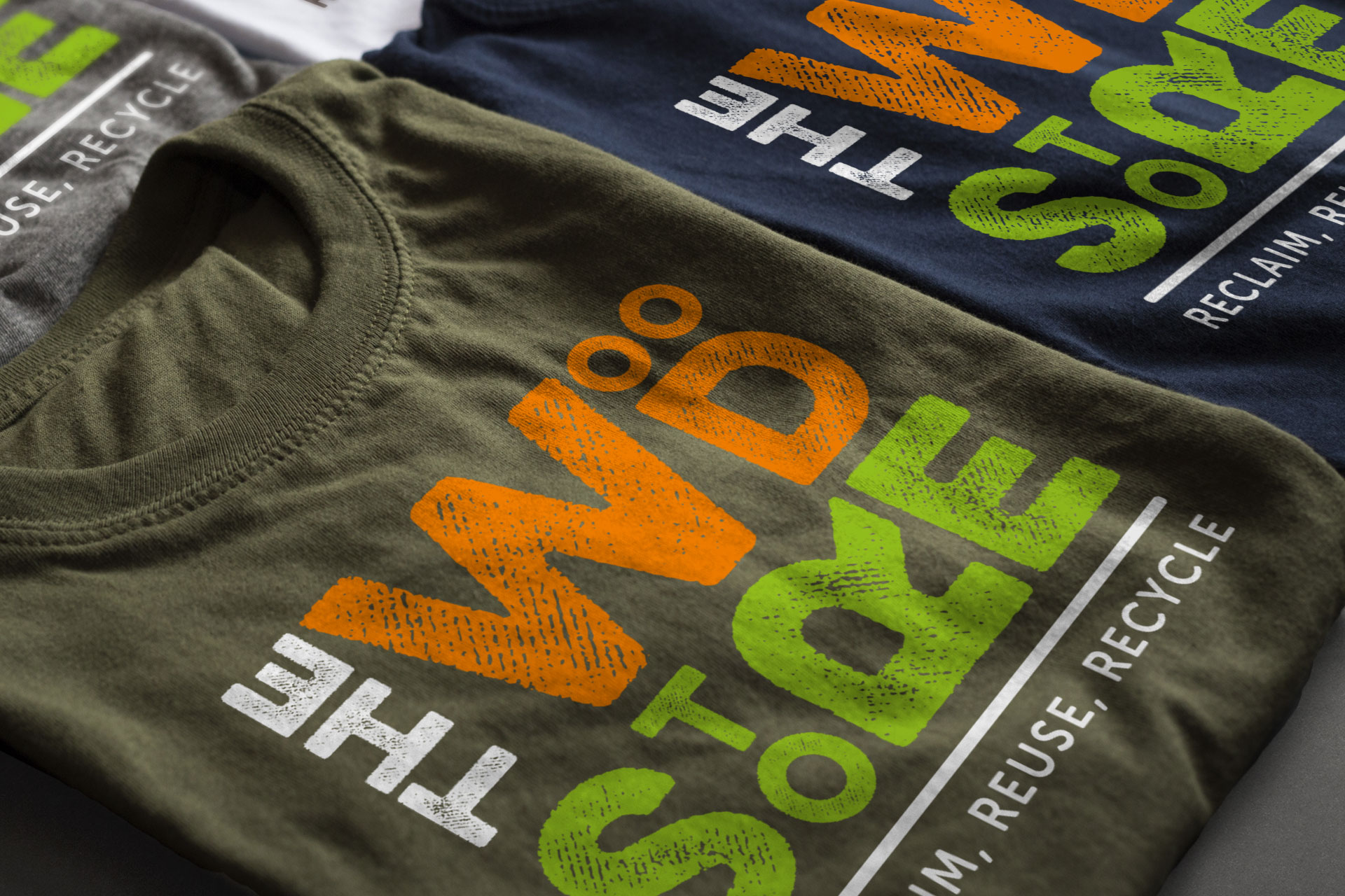
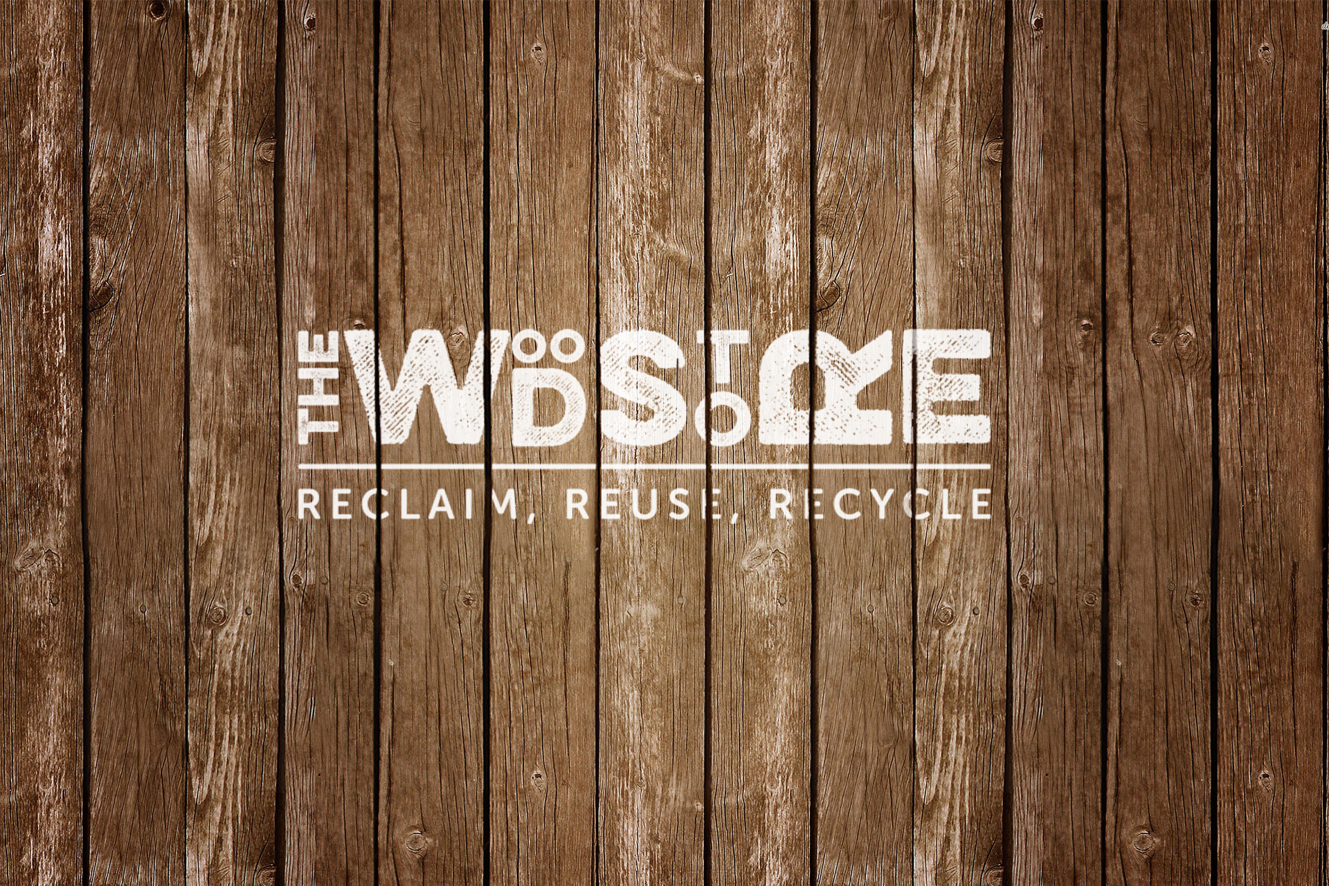
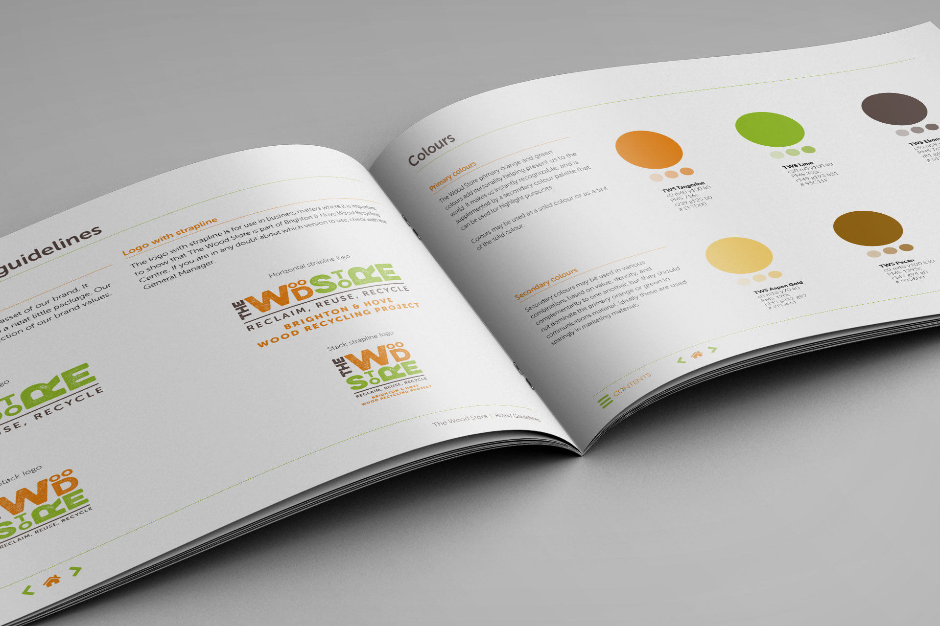
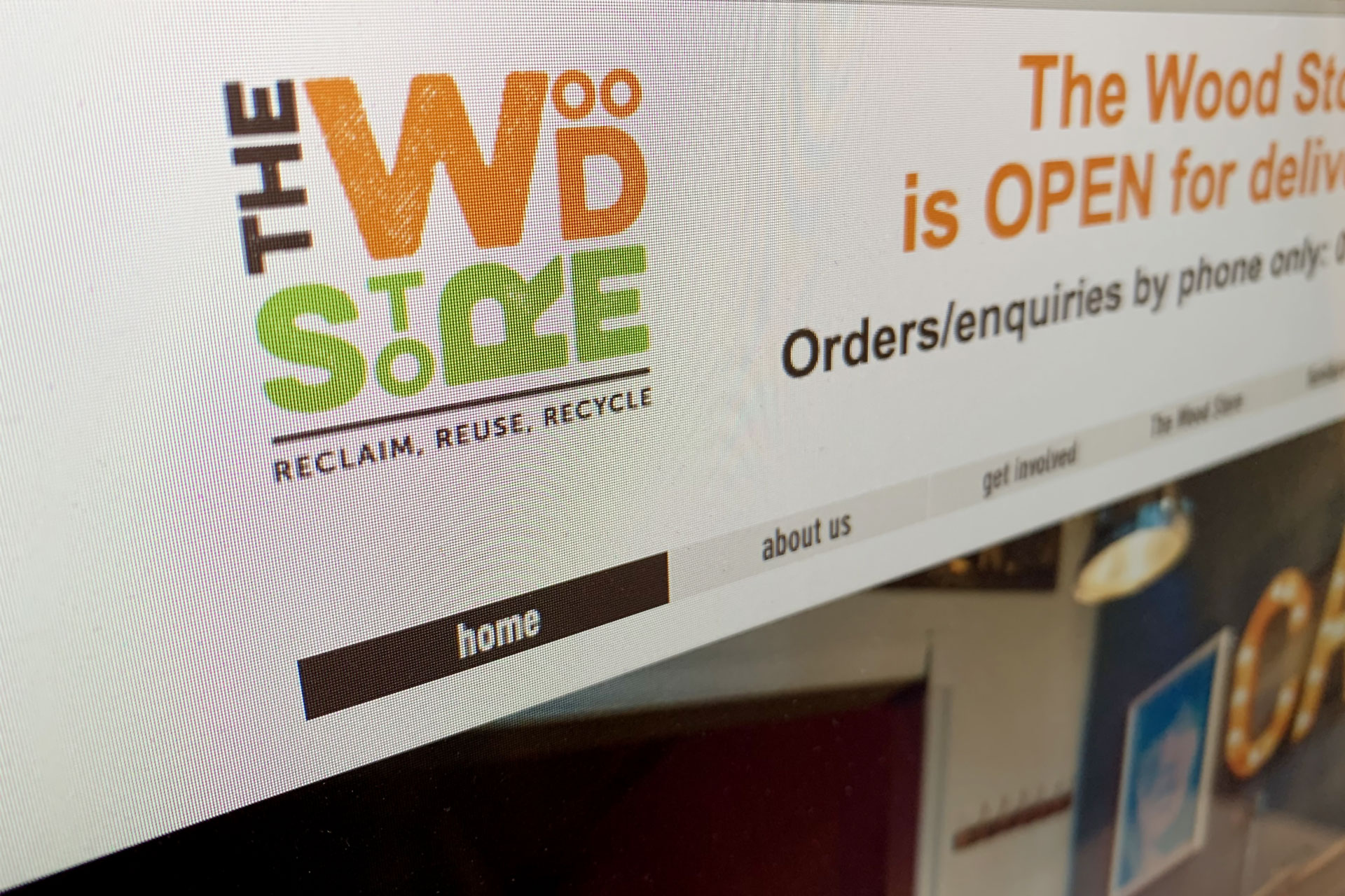
A modernisation of the existing well-known logo introducing new typography and fresh, modern colours, was combined with using a slightly distressed letterpress font. The letters within the name are stacked to represent a wood pile and combine with a descriptive strapline to create a memorable and effective logo.
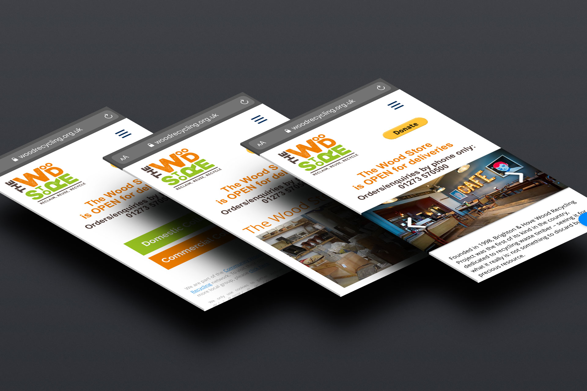
They also have two different identities – ‘Brighton & Hove Wood Recycling Project’ and ‘The Wood Store’, as well as a need to introduce a descriptive strapline. The result was to provide two logo versions; one with ‘The Wood Store’ and the strapline ‘Reclaim, Reuse, Recycle’, and another with the addition of ‘Brighton & Hove Wood Recycling Project’. This allowed them to use the heavily worded secondary logo only when needed, utilising the shorter version for the predominance of their digital and traditional marketing collateral.
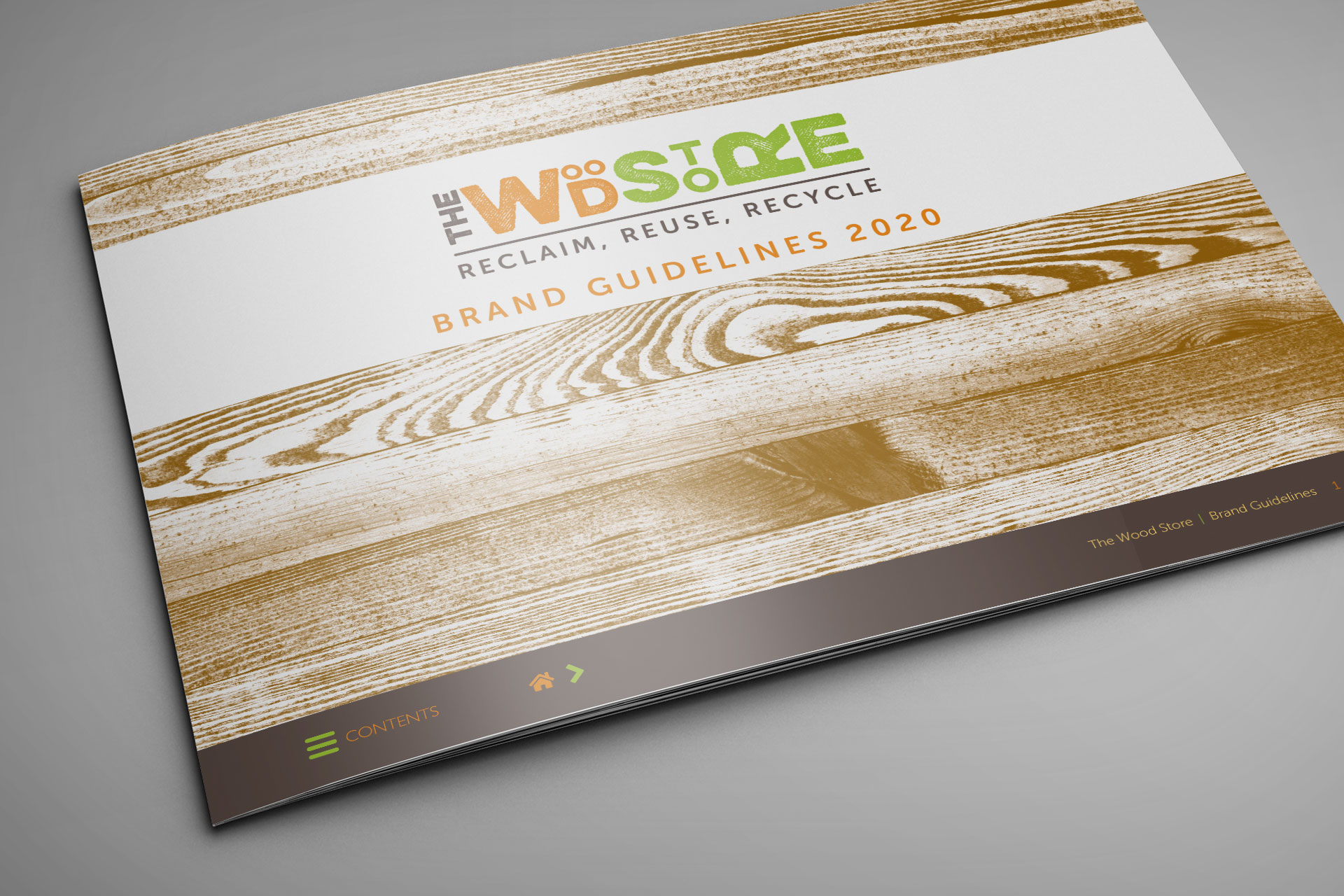
Two versions of each logo were also designed, (stacked and horizontal), to cater for all versatility in all applications of the logo and branding. An interactive brand guidelines brochure has been created to help The Wood Store roll out their new identity over the next 12 months.
If you’d like help with logo design and branding for your business or charity get in contact for a chat now.