
Serious questions have been raised about plagiarism in logo design with the unveiling of the newest branch of the United States military services logo.
On the one hand, Donald Trump’s Space Force logo gives an open nod to Star Trek’s badge, perhaps reflecting Trump’s refusal to grow up. It has also fulfilled very marketers quest to gain attention to the launch of not just the logo, but the introduction of a Space Force. Job done.
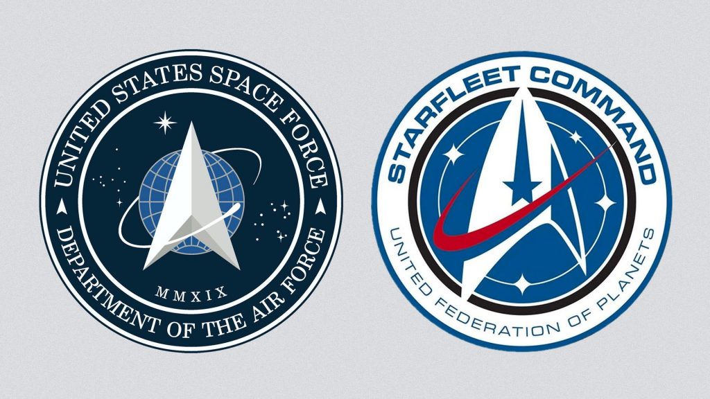
On the other hand the Space Force logo design closely resembles the Star Trek badge, (seen on the right in the image), raising the question was this just openly copied. The Space Force logo design takes many common elements relating to, well, er, ‘space’. The pointed, arrow-like craft shape, a planet, orbiting satellite and of course a sprinkling of stars. Elements that you can argue are necessary in the design of any space-related logo. But surely a good creative designer will push the boundaries to try and use more clever, inventive imagery helping to create a more distinctive and memorable logo design?
I struggle with the design of this logo, both with it’s slightly dated feel in the design elements and what to me looks like blatant plagiarism. The planet looks like a hark back to the old Pan Am logo, the sprinkling of stars a little child-like and the serif typography around the logo simply dated and weak.
To be honest I wish they had boldly gone and just asked the owners of the Star Trek legacy if they could just use their logo. It’s much clearer, distinctive and even futuristic.
Beam me up Scotty!
Check out Design Week’s article ‘The United States Space Force logo deconstructed’ https://buff.ly/2O30oNW
If you would like some help on creating a distinctive and original logo for your business or organisation, then get in contact for a chat about how we can help you.